Golmat
Golmat Group provides a wide range of solutions for construction and architecture. The rebranding challenge was to create a visual language that would put Golmat on architects’ shortlists as a preferred choice. Our goal was to establish an international design standard that feels innovative and refined, while remaining flexible and accessible.
Golmat’s distinctiveness lies in its combination of international standards, quality and innovation with care, flexibility and initiative. This combination defines Golmat as “the smart partner,” thinking alongside clients and working with them to solve problems.
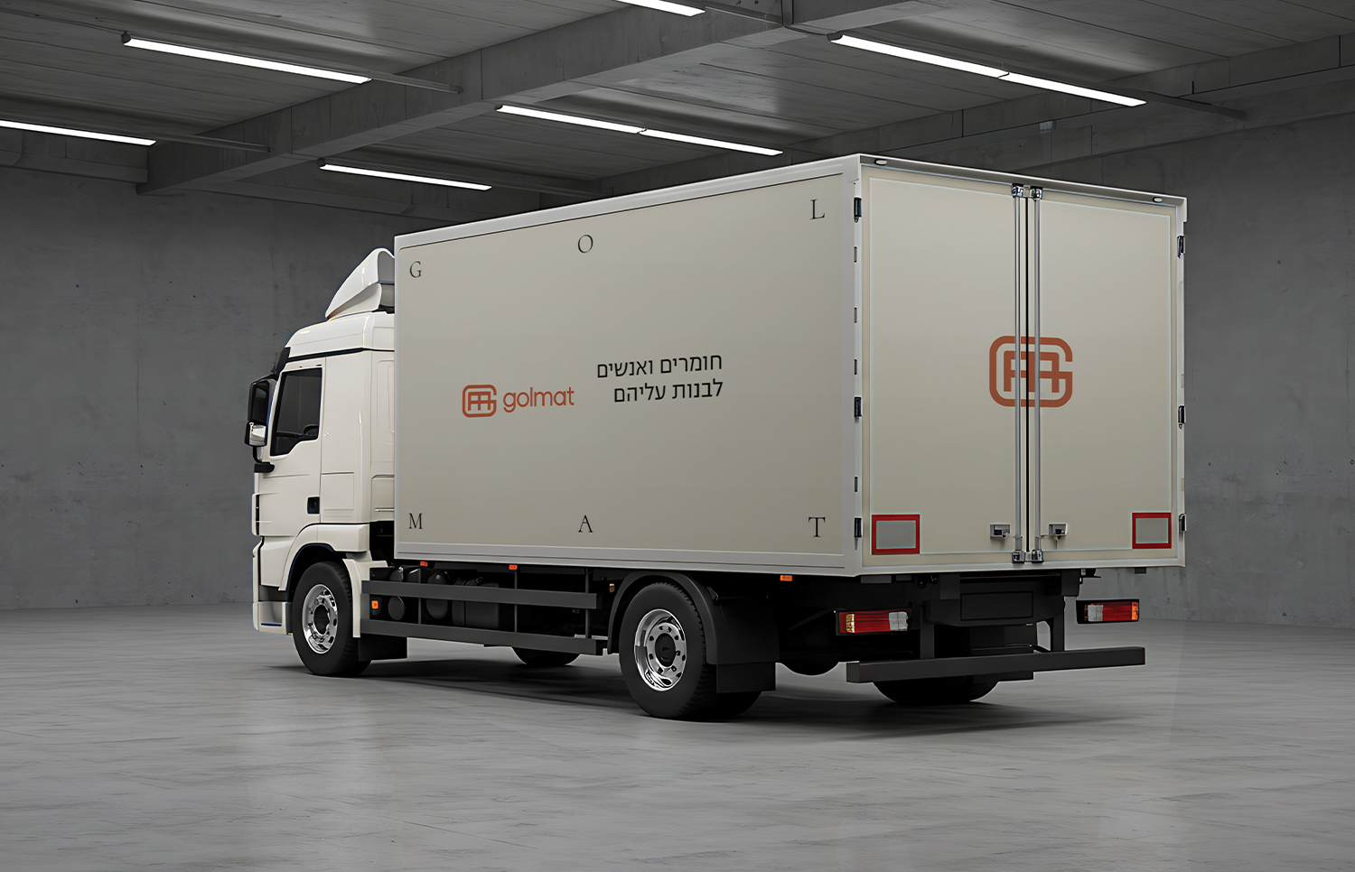
Under the concept of “Geometric Form,” we developed a visual system inspired by materials, hierarchy and connection. The group’s areas of activity were brought together under a single masterbrand: Golmat. Divisions were differentiated through their names and bespoke graphic patterns, each inspired by the division’s materials and products. The result is a distinctive, harmonious and balanced geometric language.
The logo was visually updated while preserving the formal and graphic DNA associated with Golmat. This maintained continuity with the company’s established identity within the new brand language.
The colour palette pairs a signature orange with warm concrete tones and complementary colours that distinguish the divisions. The photographic language draws on textures and architectural cladding, combining a human touch, warm colours and natural light to create a clean, minimalist aesthetic with a contemporary Nordic sensibility.
The visual language was extended across digital and print applications and documented in a brand guidelines book. The result is a cohesive, precisely defined graphic system that allows materials, architecture and ideas to speak for themselves.


let’s create
together
the persistence, and the journey they take with us along the way.
Ready for your next challenge? Let’s get to know each other.