the123
Rebranding and visual language development for the123 – vitamins, nutritional supplements, and care and healing products.
Through a strategic process, we repositioned the123 to strengthen its presence in a competitive market. We crafted a new brand line: “all good inside” – bringing all the goodness in, so your body thanks you with every use. This created differentiation and paved the way for a new brand identity.
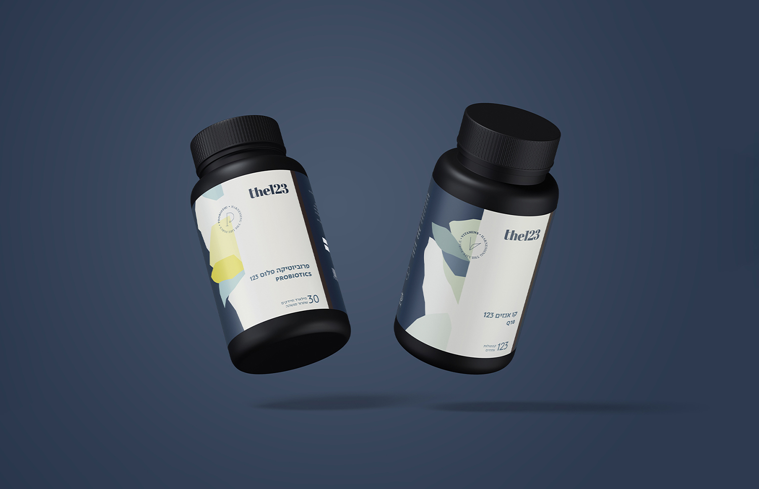
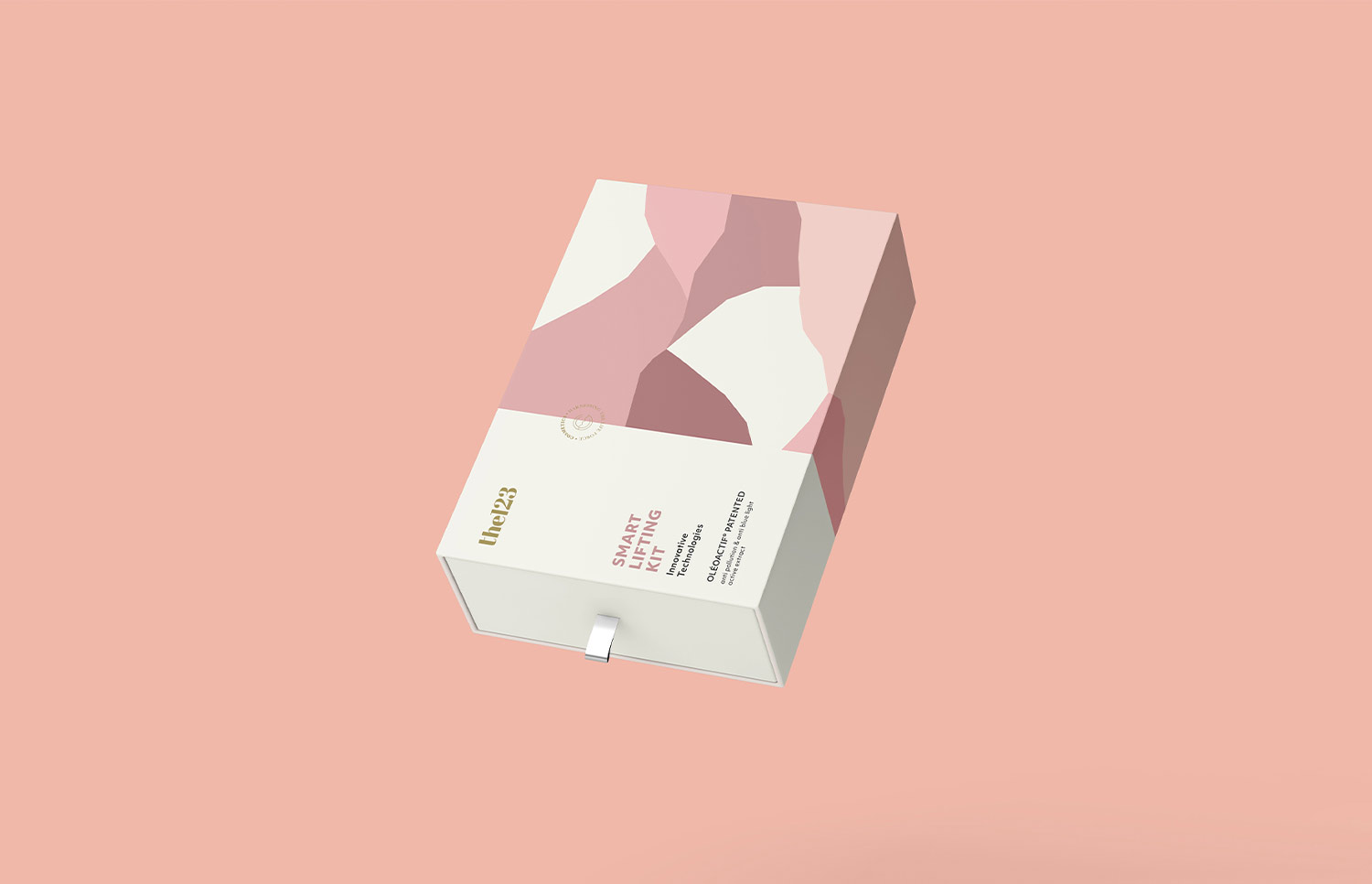
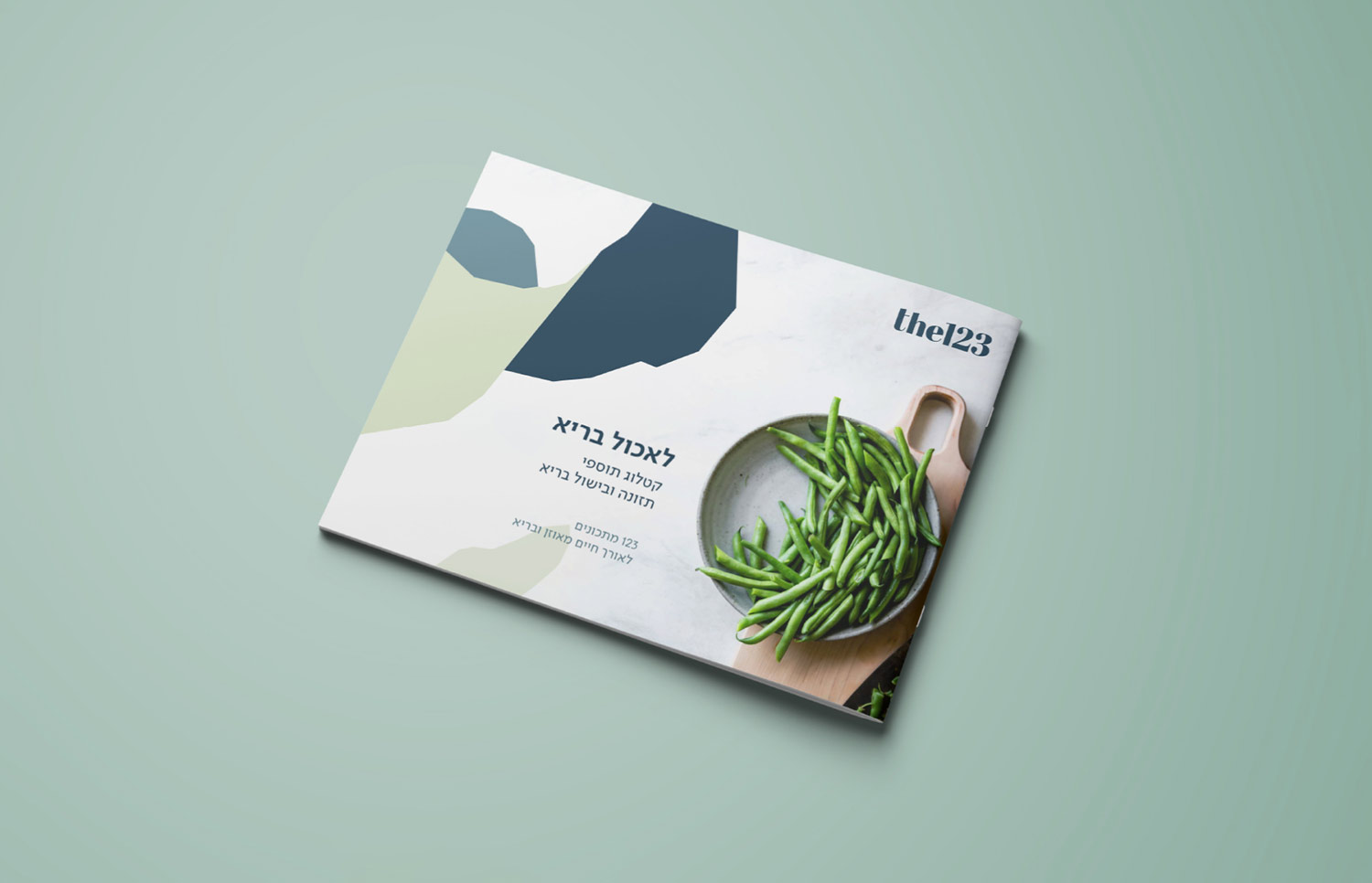
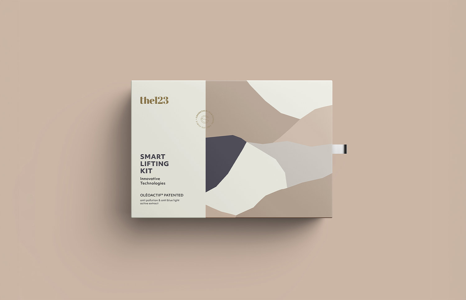
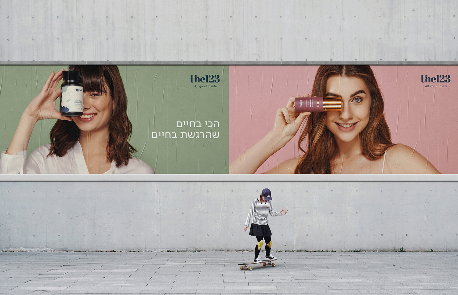
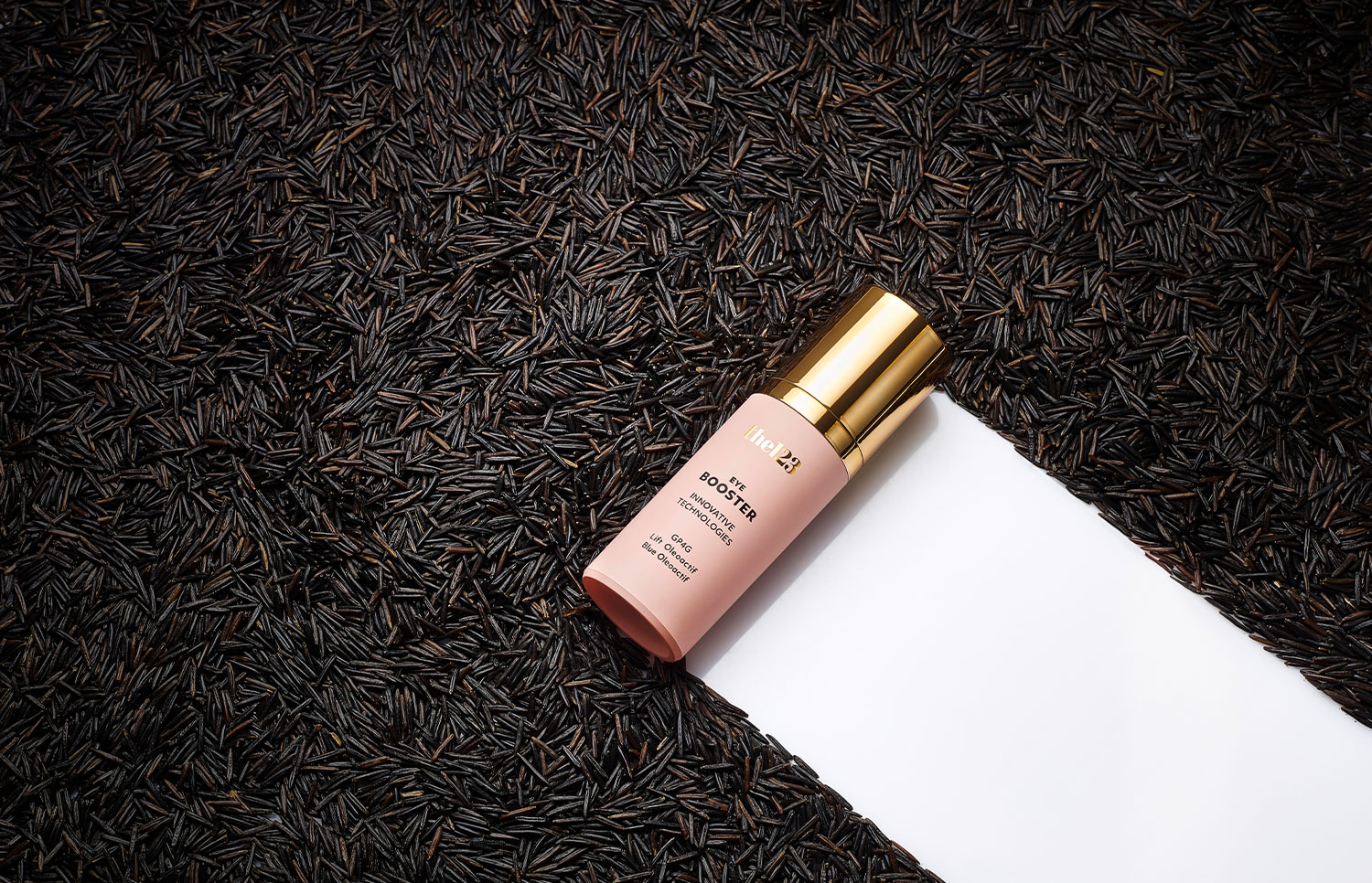
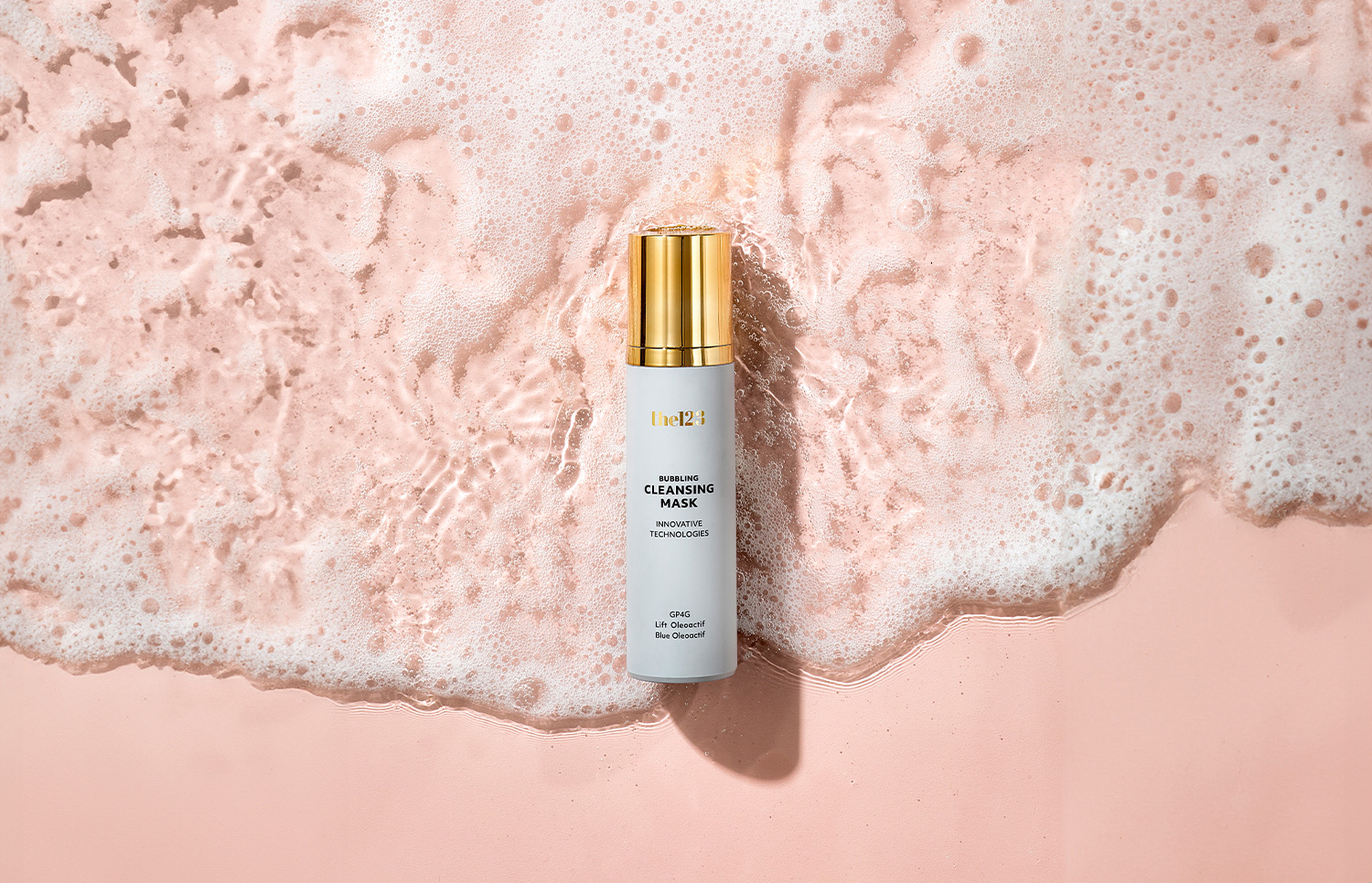
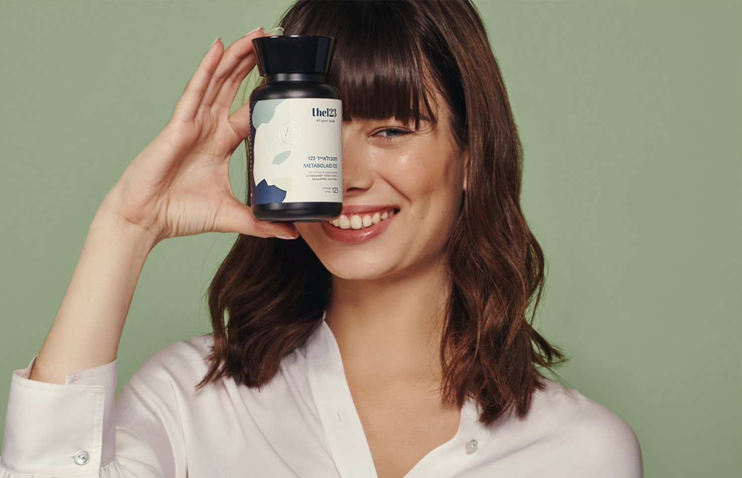
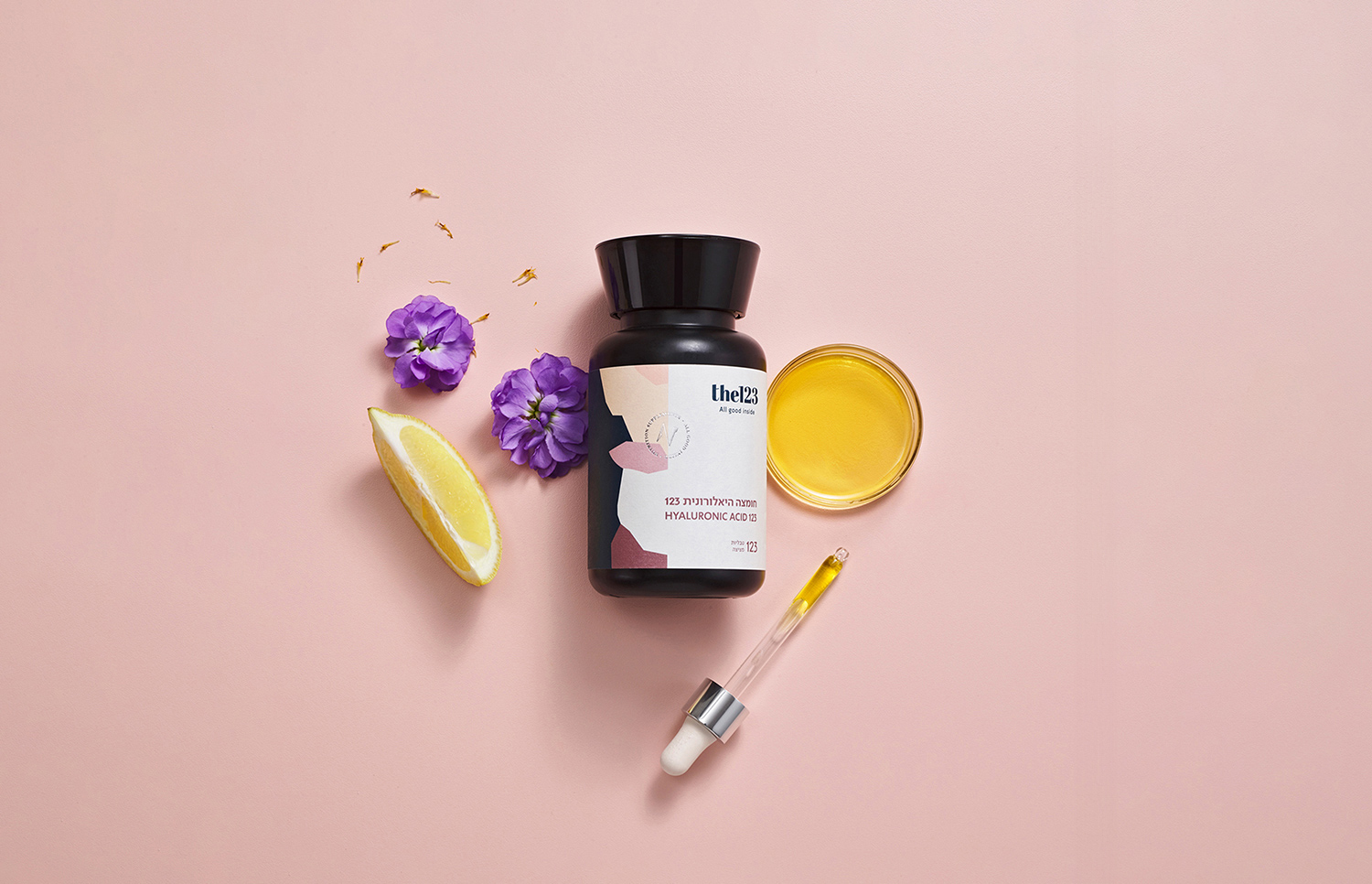
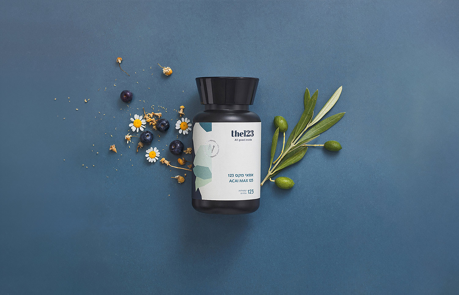
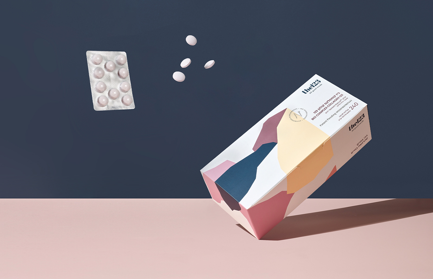
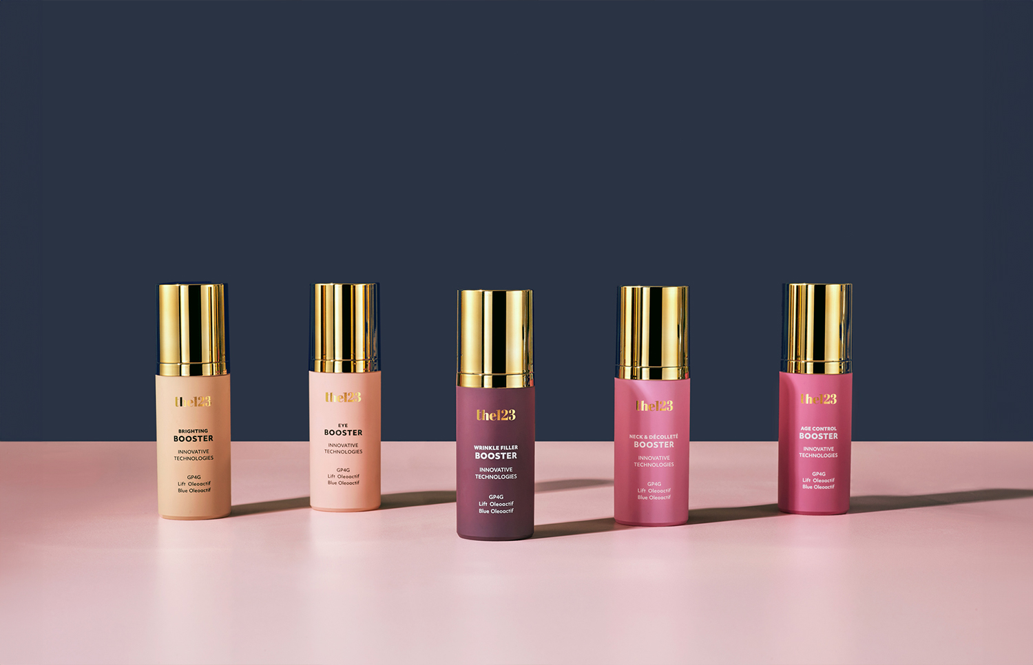
As part of the creative process, we created a new brand identity and developed a graphic language inspired by wild mountain nature. We designed a new logo aligned with the company’s core values, conveying stability and timelessness. We tailored primary and secondary color palettes for each segment: vitamins and nutritional supplements, care and healing products, and healthy snacks. Each color palette was carefully selected to communicate the unique values of its category. We developed an original icon system, adapted a bilingual brand typeface and created a photographic language. As a significant part of the creative work, we produced photo and video shoot days in a minimal and balanced visual style.
At the brand language implementation stage, we planned and designed a new e-commerce website, including a full UI/UX process, content writing and microcopy. For print, we designed and produced rigid boxes, labels, posters and shelf talkers. For social media, we designed brand and marketing posts.
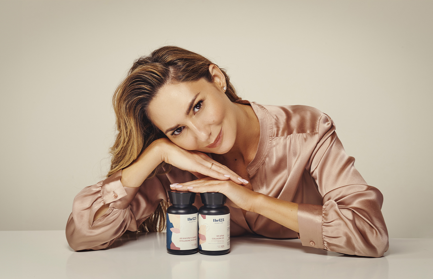
Finally, we launched an awareness campaign featuring the company’s brand ambassador, Michal Ansky, as an opinion leader who conveys inner strength alongside calm and peace of mind, in line with the company’s values and the new brand language.
the123 is built on a simple belief: when you nourish your body with the very best ingredients, it knows how to thank you. That’s why we chose the brand promise “all good inside”, because true wellbeing begins from within.


let’s create
together
the persistence, and the journey they take with us along the way.
Ready for your next challenge? Let’s get to know each other.